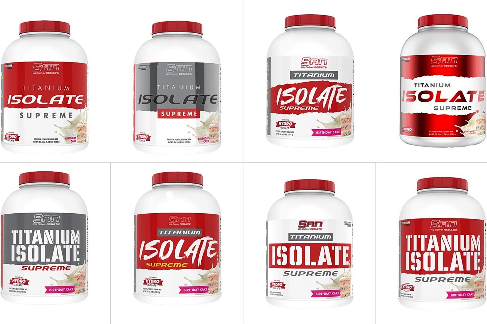
Alpha Sports Nutrition isn’t the only supplement company about to get into a fresh new look and feel; the long-running legacy brand SAN is about to do the same, although it is going about the whole thing a little bit differently. The company has shared a preview of an entire host of rebrands, eight to be exact, and while they each have their own points, features, and differences, they all maintain SAN’s signature mixture of colors in red and white, which was once a bit darker in black, red and yellow.
SAN has shared eight different looks, but they are relatively similar, with most of the changes from one to the next being the title font and background graphics; in fact, even they don’t differ too much where across the eight rebrands, there are really only four fronts. If we had to choose, we’d probably go with the very first one, the top left in the group image above. It simply comes off a bit more uniform, thin, and lightly spread text, so it’s not too busy, and the colors have a nice red-on-white contrast.
SAN is actually giving fans the chance to share which of the rebrands they like the most by putting the whole thing to a via social media, and if you help out and put forward your thoughts, you’ll go in the draw to win a bottle of the premium whey isolate-powered Titanium


