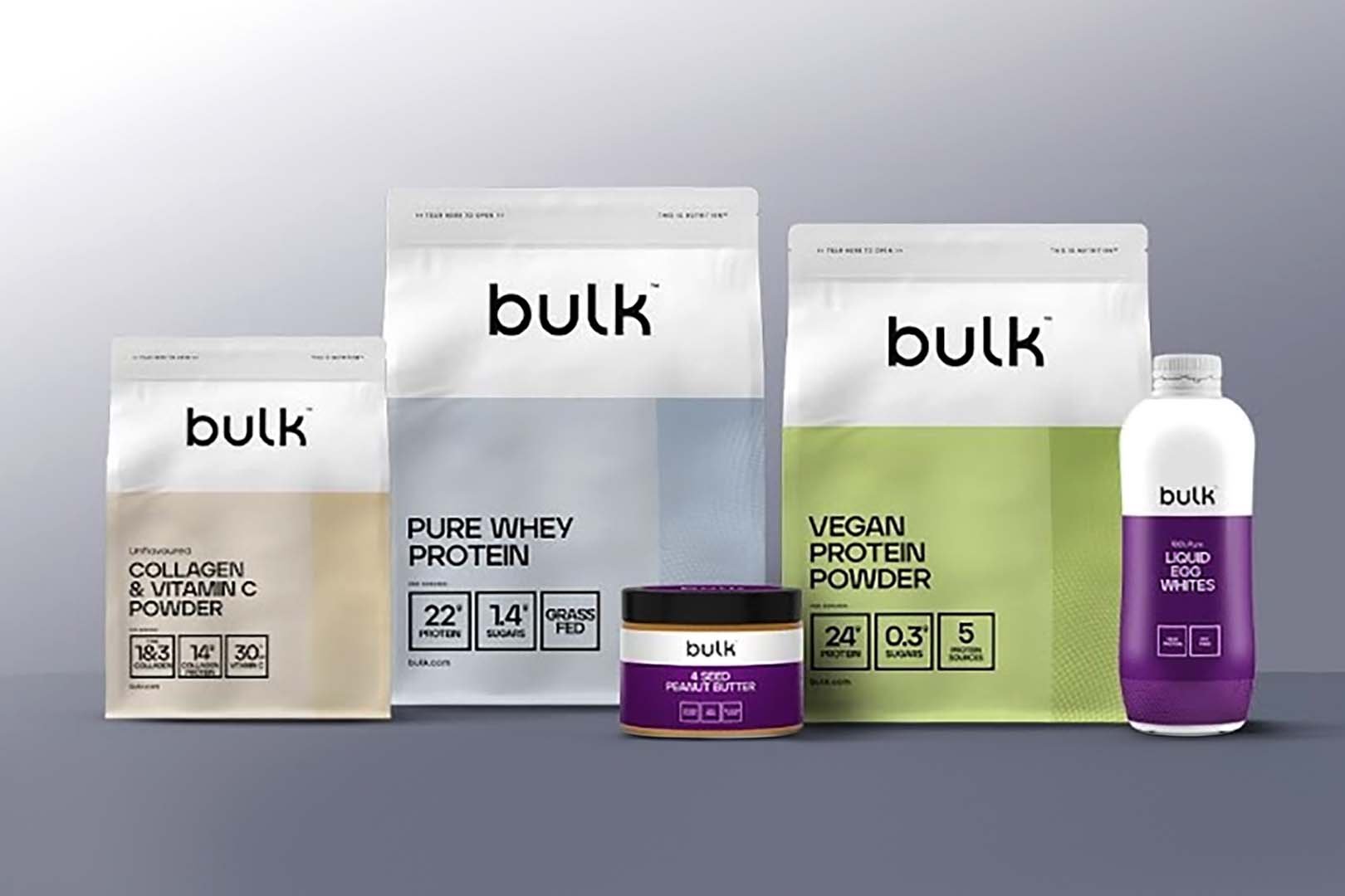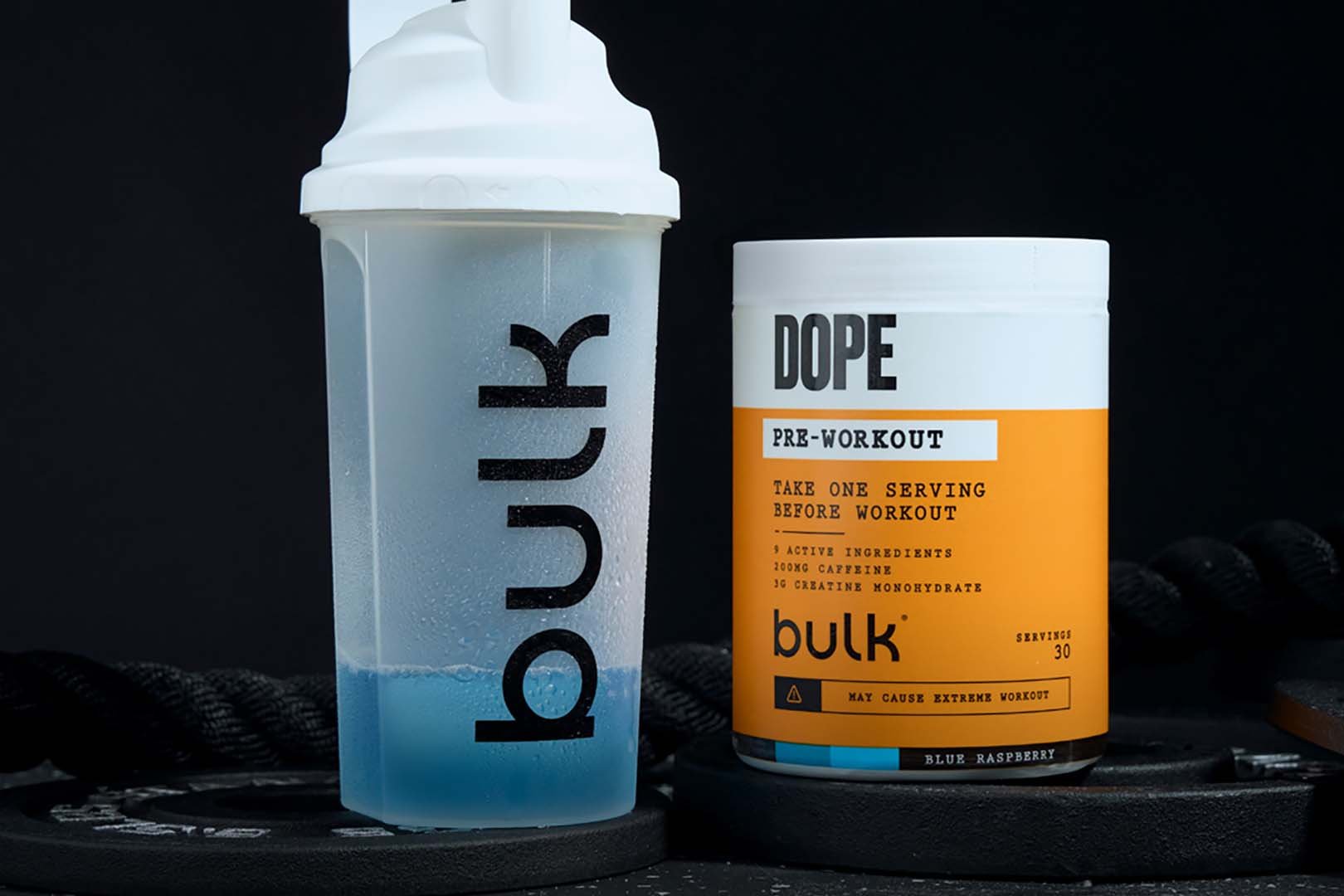
Almost at the flick of a switch, similar to the last time it rebranded, Bulk has refreshed its website with its all-new look and feel, first pictured and previewed a couple of weeks ago. Bulk is one of the biggest and most extensive health and nutrition companies in the industry, with a selection of supplements, reaching into every corner and category you could think of. When we first saw its new look, it was on a handful of products like Pure Whey Isolate, but it has indeed been applied to everything it has available.
You can see what the all-new look of Bulk is about in the image above, with a more uniform, color-divided design where you get vertically and horizontally separated blocks of color alongside all of the supplement’s intricate details, and those colors change depending on the item. As mentioned, the UK-based brand has indeed rolled out its revamp this month over at bulk.com, where everything except for a few products here and there, have that almost simplified yet more open and direct design applied.


