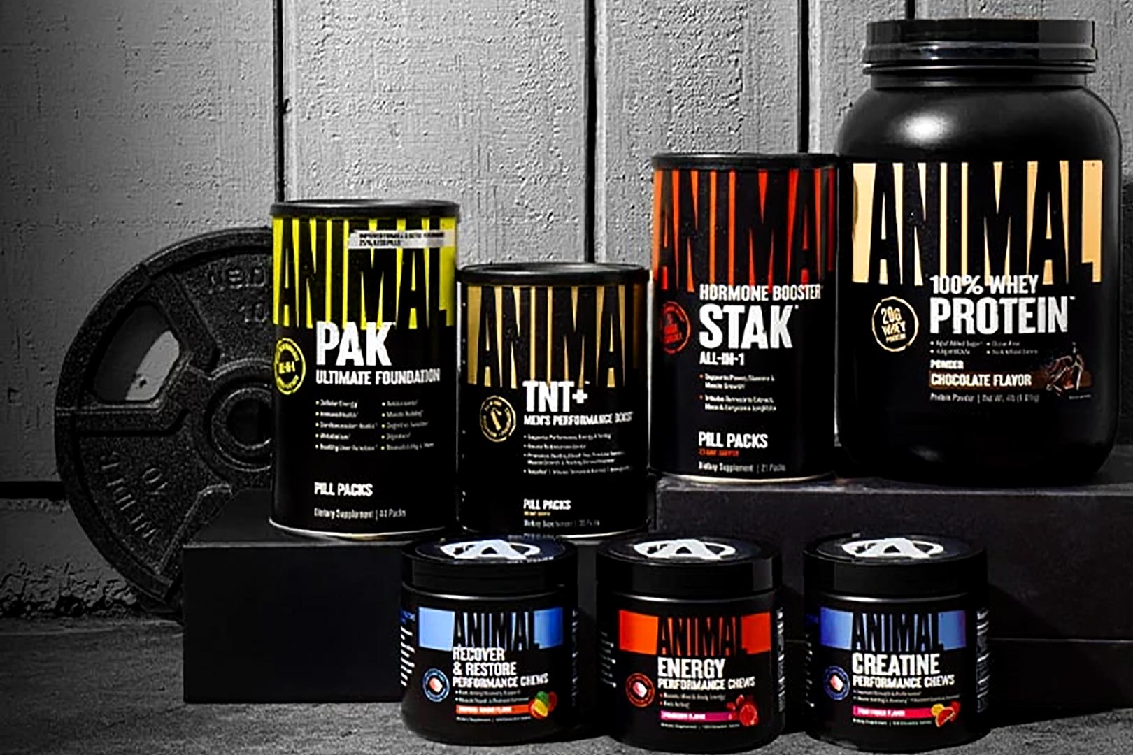
The hardcore legacy sports nutrition brand Animal, responsible for the iconic multivitamin Animal Pak and many other long-running supplements, has undergone a bit of a rebrand following last year’s rather significant shift from the wrap-around iconic look that stood for several years. This time around Animal has not made as many tweaks and changes, staying pretty close to its last rebrand, with the main idea being better communication.
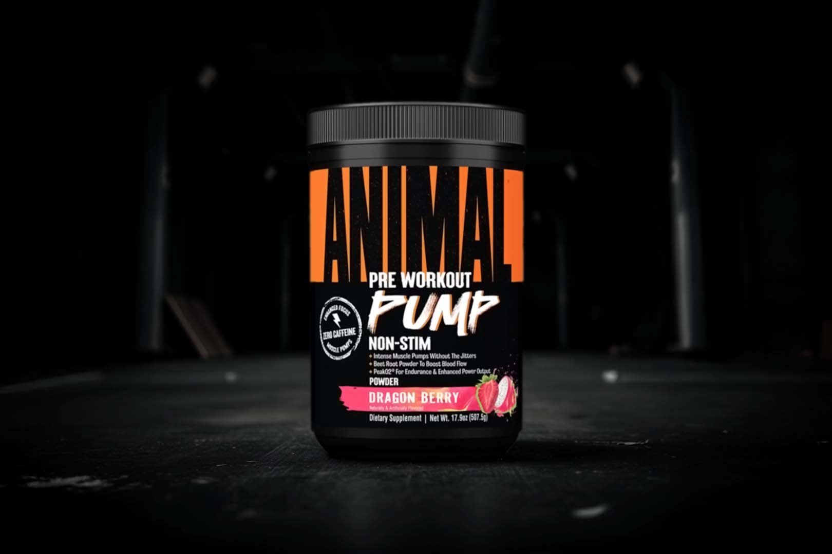
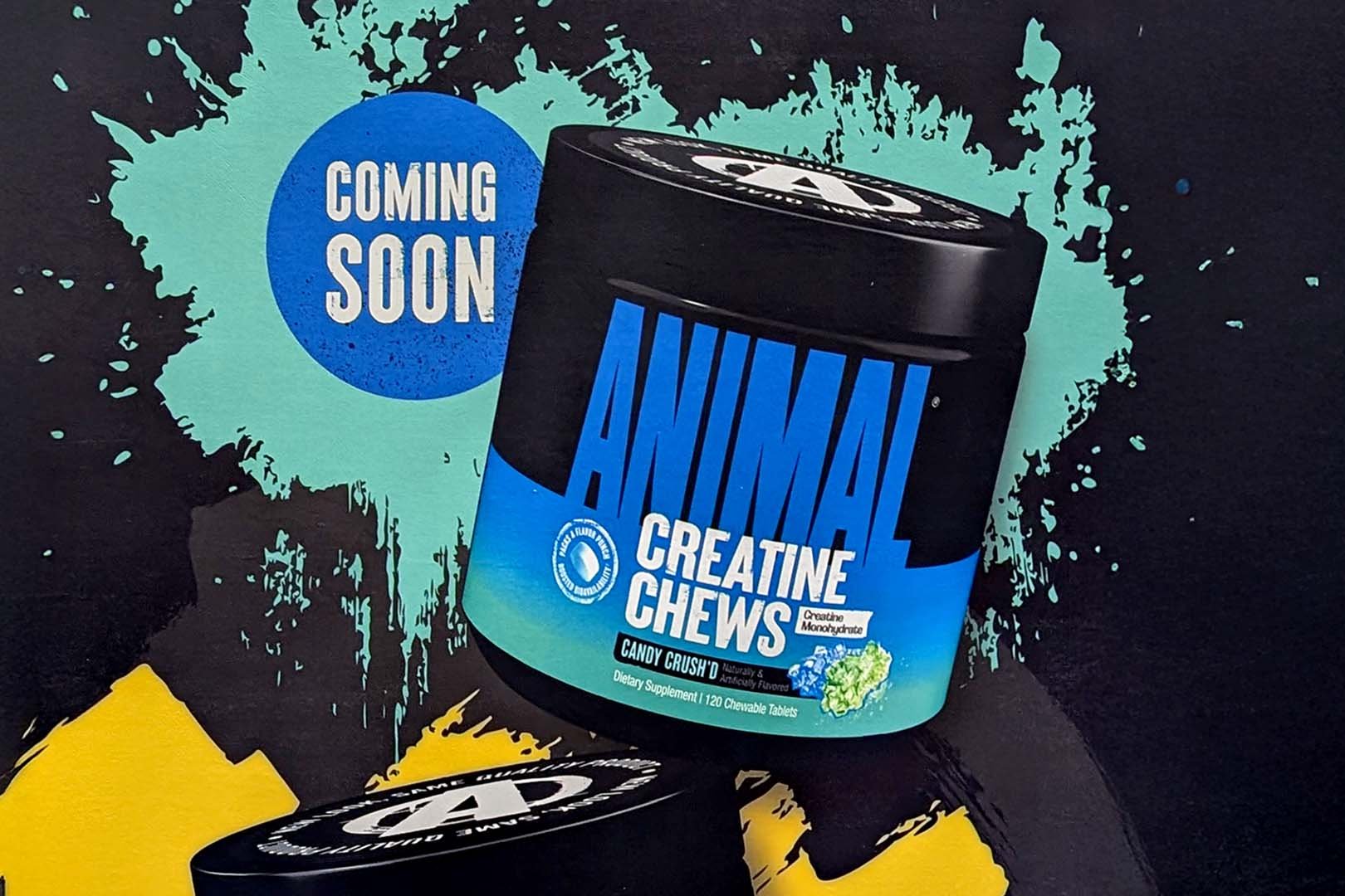
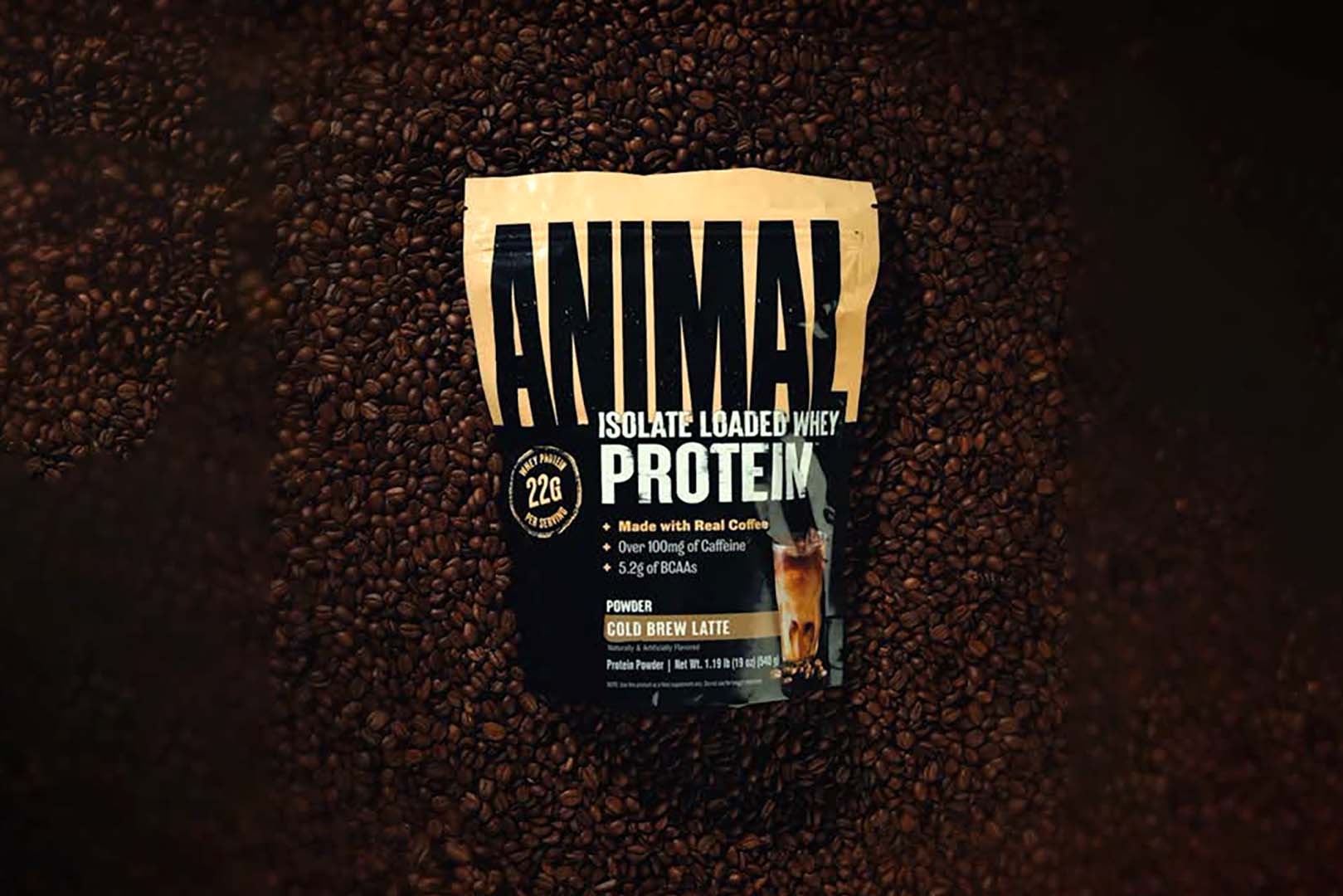
You can see what the refreshed Animal supplements look like in the image above, which, again, isn’t that big of a shift from what it currently has on the market. The most notable differences are that there is no iconic graphic behind the logo anymore, just the classic Animal name and font. The logo has also been pushed up a little higher so that it doesn’t stretch as far around the products, and in turn, it leaves more open space for information.
Animal has taken advantage of that extra room on the front of its many sports nutrition supplements to help details and important information stand out more while still keeping that familiar look and feel of Animal products. The brand is gradually transitioning everything on its website to the refined design, with nothing changing in regards to the formulas and there is some renaming, such as the women’s Alpha F going to Animal Power Balance.


