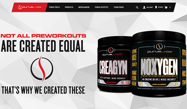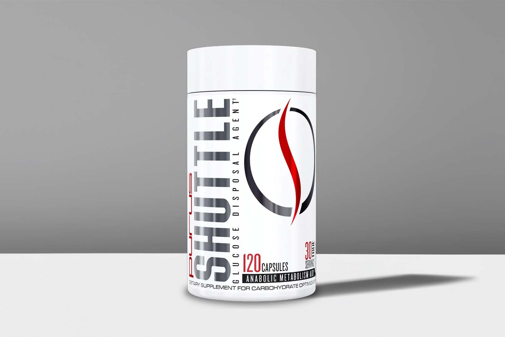
The well presented brand Purus Labs has just updated its online presence to match the stylish look you see on all of its supplements. Basically the brand has completely made over its website, giving it a much simpler, cleaner look. Instead of keeping it quite dark, Purus has gone for a mostly white and bright design, which also helps make the layout appear a lot more spacious. The actual information on there doesn’t seem to have changed much, with the same product details, team information and store. Anyone interested in checking out the new Purus Labs website can do so at the brand’s same address, puruslabs.net.
COMMENTS


