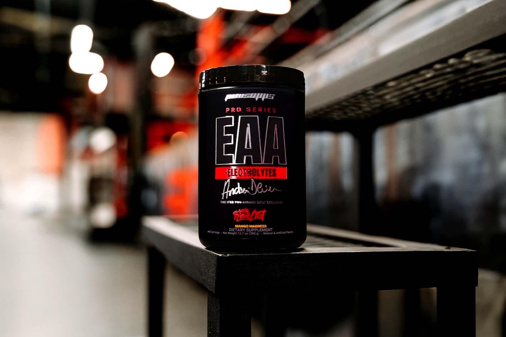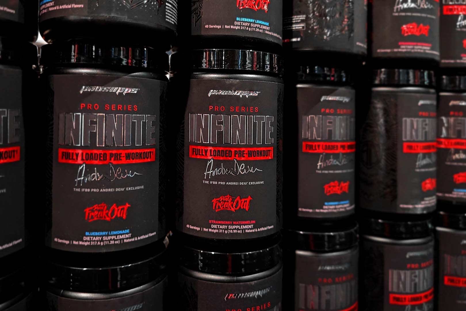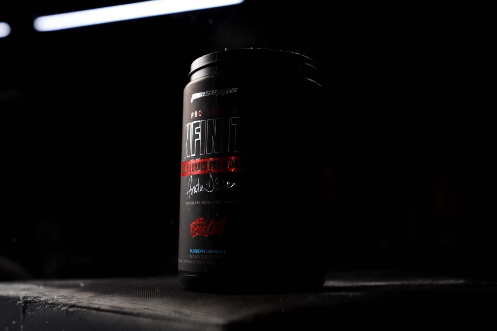
With a massive rebranding of their range it’s no surprise Pro Supps have also given their online presence a bit of a makeover. Instead of just adding updated pictures of all their supplements in their new much more appealing black and red uniform. The brand have completely redesigned their website, uploading a theme equally as impressive as the one of their products. While Pro Supps have maintained their motivational video featuring the brand’s CEO TJ Humphreys going over what drives him, on their home page, that is all that may seem familiar. The design has been switched to the more commonly seen stacked layout with blocks of information layered on top of one another. As mentioned Pro Supps have also replaced all of their old supplement images with new ones except for DNPX, Pure Karbolyn though it already stood out with its throwback look, and to some extent the Mr. Hyde RTD. No doubt the new site took a lot of time and effort, however it is the rebranded products that steal the show, and look even better when they’re laid out one by one. To check out all the changes for yourself, simply visit the same address as before prosupps.com.


