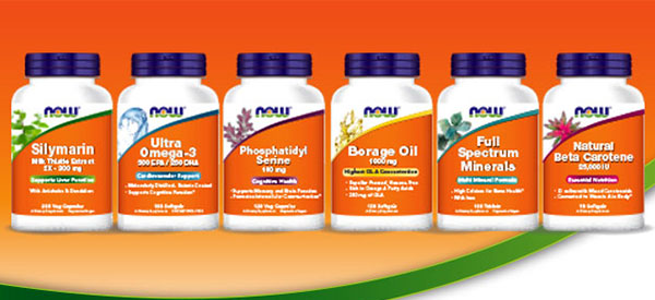
One of the most reliable supplement companies in the industry has unveiled an updated look, set to replace their current one that’s been around longer than we’ve known them. At the moment NOW’s products all carry different designs depending on what series you’re looking at, with most probably knowing them for their bright orange Supplements and Sport Nutrition lines. The new theme NOW have revealed sees their Supplement’s range only subtly altered dropping the circular background graphic, font and eye catching amount of purple. The major things the brand have carried over and/or improved include the attention grabbing orange, dark purple caps, and neatly laid out information on the front. To enhance the whole design NOW have also added graphic representations of each product in the top left, with a color matching divider and highlight behind each formula’s short description. While most companies would only be looking at between five to ten supplements when they rebrand, NOW’s relabeling will be a lot more of a mission with the amount of products they have to offer. We don’t imagine the move being a smooth immediate transition, more or less something we’re going to see happen over time from month to month.


