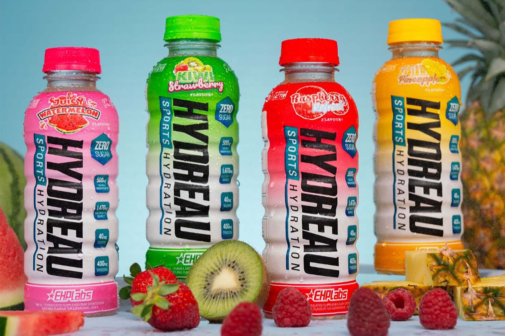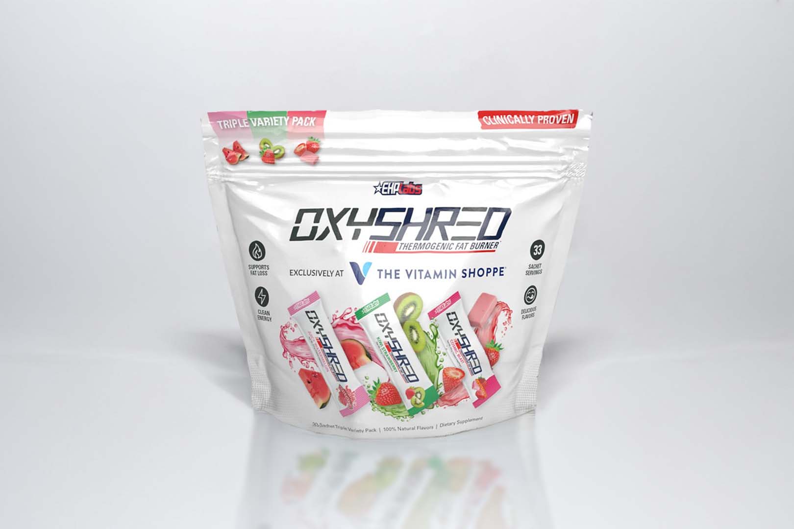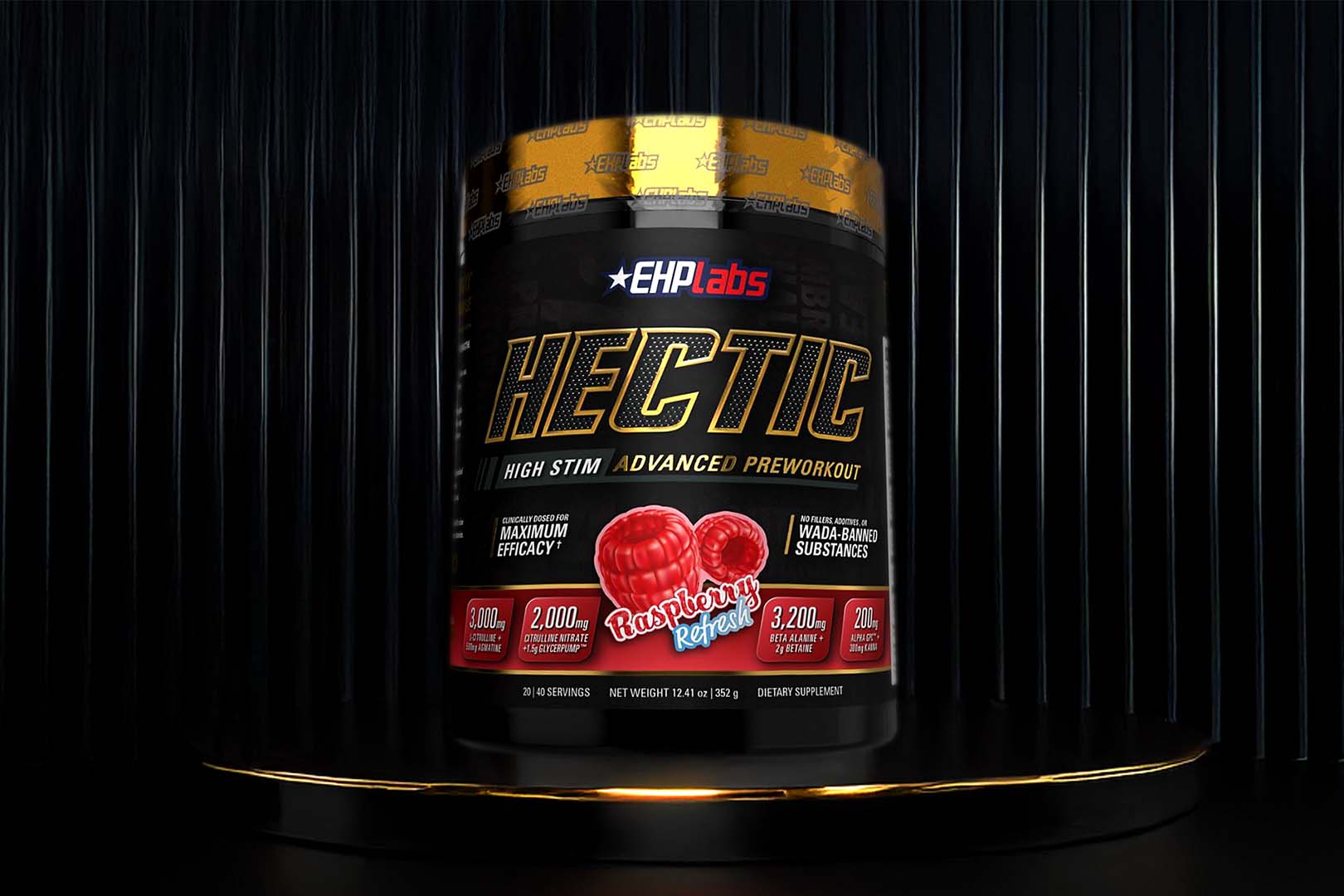
EHP Labs were one of the many companies with a booth over the weekend at the LA Fit Expo, although they’re not yet a brand you’re likely to find at your favorite nutrition store. Being an Australian born company they are of course trying to make the jump from their local country down under to the mother of markets, the US. We’ve never actually tried any of their products personally, however always thought it was a bit strange that their supplement naming conventions as well as their own title, were strikingly similar to that of USP Labs. Competitor likenesses aside the topic for EHP Labs today is their website, which is no longer the unbalanced slightly dull design is used to be. Instead the brand have gone as modern as possible, putting together a layout that really sticks to the belief that less is more. As wide spread and as graphic driven as the site is, EHP have kept the navigation well organized and extremely simple, distributed information efficiently across all pages, and even added an awesome transformation section highlighting real life results. The online display is definitely one of the better supplement company websites we’ve seen, right up there with the likes of Beast and BSN in terms of style and well worth checking out.


