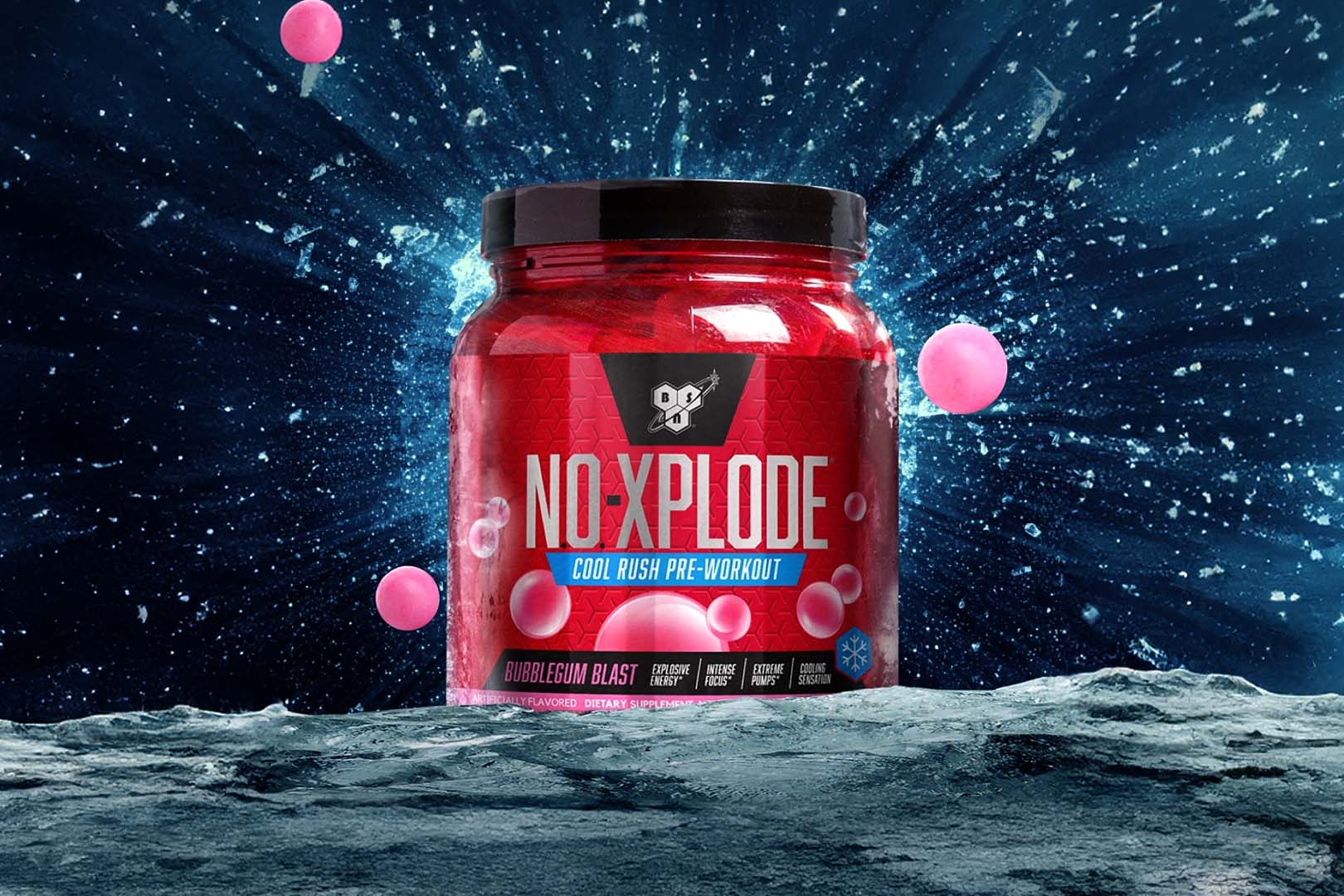
Updated websites have been quite the trend this year with supplement companies, seeing a lot more getting makeovers than we can remember from 2013. Most of the time it is the smaller brands making the move, this week however we’ve seen one of the bigger names retheme their entire site. BSN is the company who has made the jump, going from a website dating back a few years to a much brighter, simpler, modern design. The brand have dropped their slightly dark imagery, technical graphics and full page layouts, for a theme that basically looks like a more complete version of N.O. Xplode’s BSN Push. As mentioned everything is a lot simpler, with BSN putting attention on just a three page menu listing products, athletes, and where to buy. The brand do have and link to a few more things in the footer, but compared to their previous site, BSN have really simplified their online experience. You can check out the updated website for yourself, and see how the veteran brand are now representing themselves at their new address, gobsn.com.


