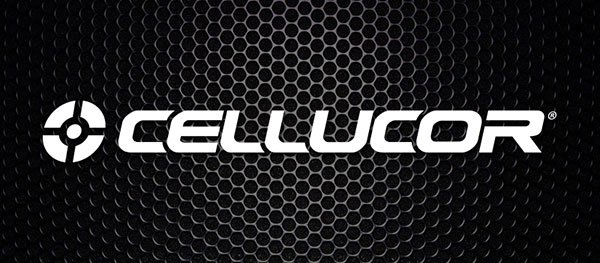
One of the best looking brands around have made a few alterations to their look for 2013. While most companies make major updates, Cellucor have only tweaked their logo. Of course they have new marketing campaigns, but it is the iconic emblem of the brand that has taken on some changes. Compared to their previous symbolic circle, Cellucor now rests it’s entire signature on a (estimated) 10 degree angle. Lately the new italicized logo has been featured on a number of the brand’s images and will probably make it on to their website very soon.
COMMENTS


